The problem with “good exposure”
Why more dynamic range doesn’t mean more meaning
A photographer friend once asked me a question that, on the surface, sounded simple.
“How do you deal with the shadows in your photos?”
I asked him what he meant.
“Well,” he said, “how do you expose for the shadows so you end up with a good exposure?”
That phrase momentarily puzzled me.
A good exposure…
Not because it was wrong, but because it revealed how differently we were thinking about the same thing.
He was talking about shadows as a technical challenge.
I was thinking about them as a form of visual communication.
Of course I expose my photographs very intentionally.
But my aim is almost never to arrive at what we casually call a good exposure.
Because what does that even mean?
An image where everything is visible and evenly exposed?
Where shadows hold detail and highlights are perfectly controlled?
Sometimes that’s exactly what’s needed. But often, it’s not.
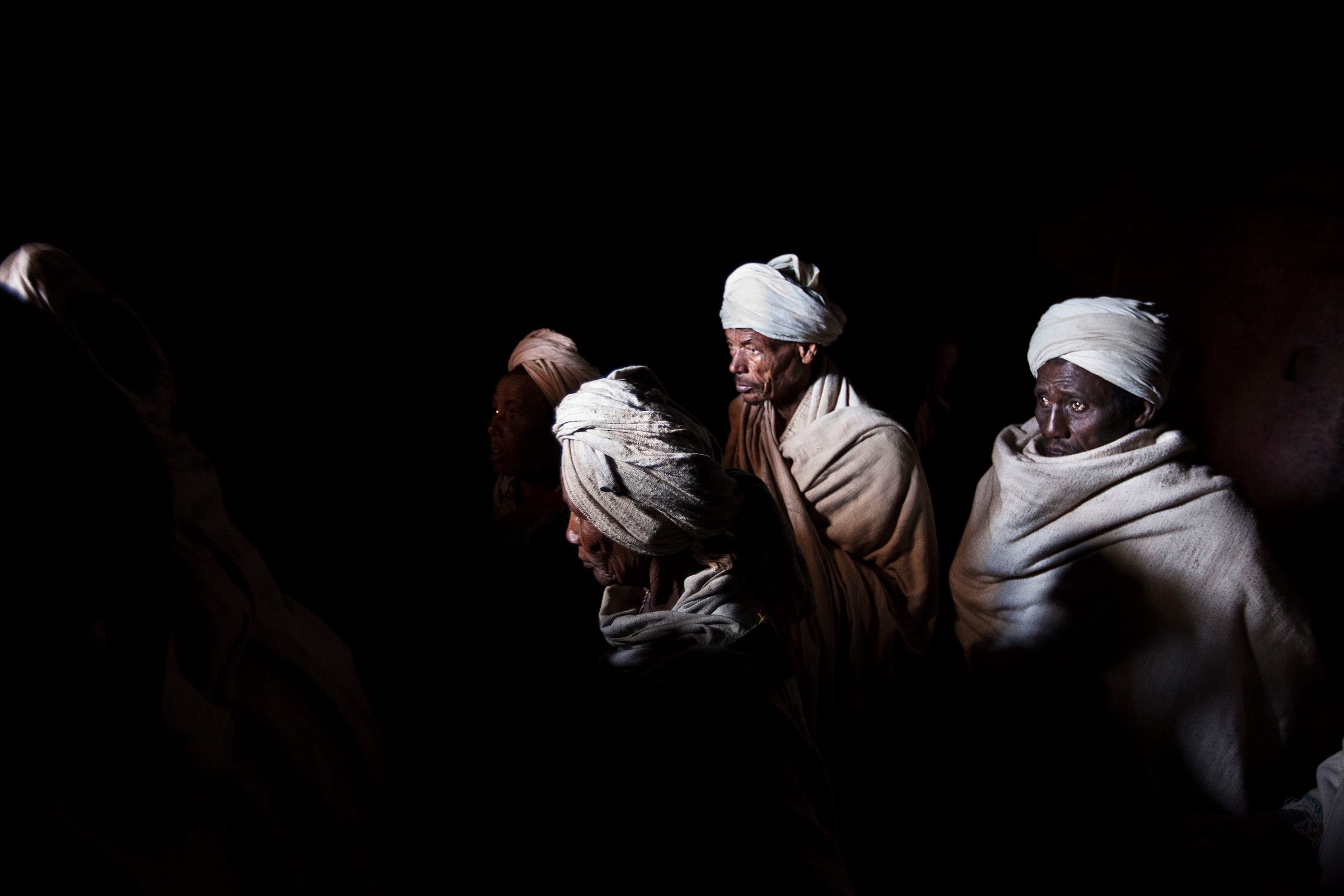
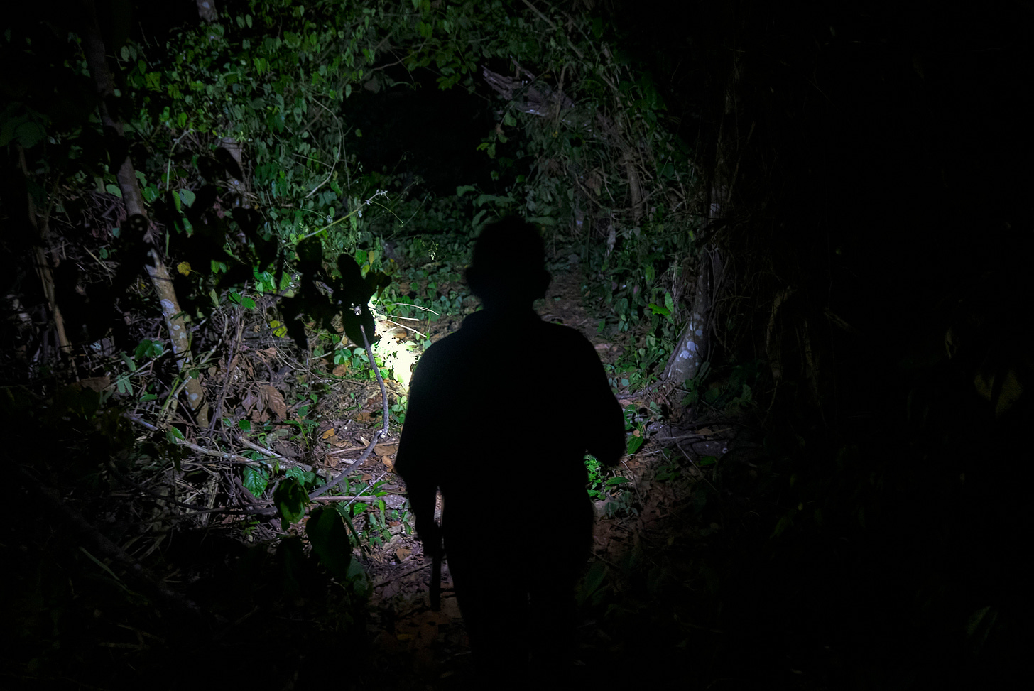
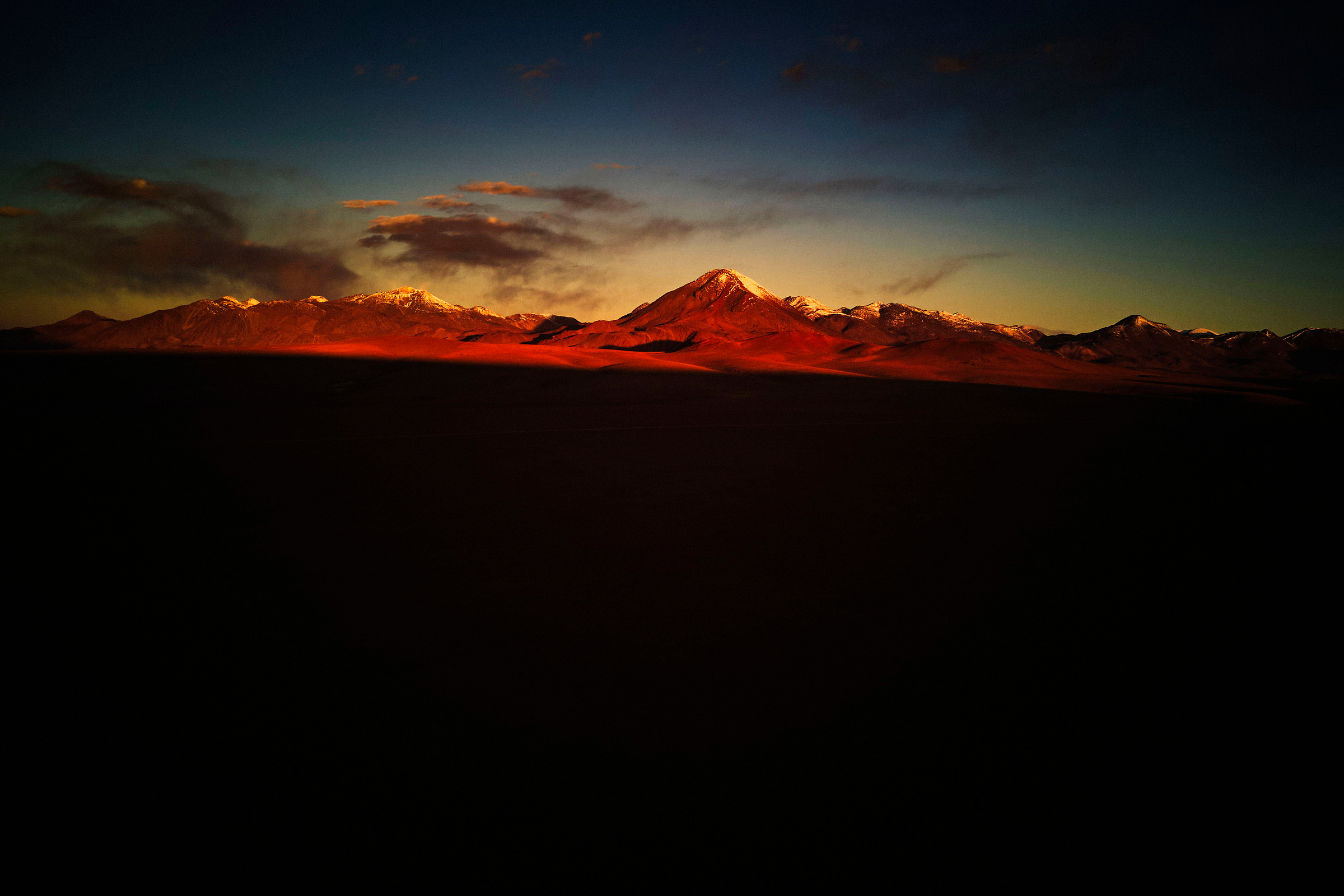
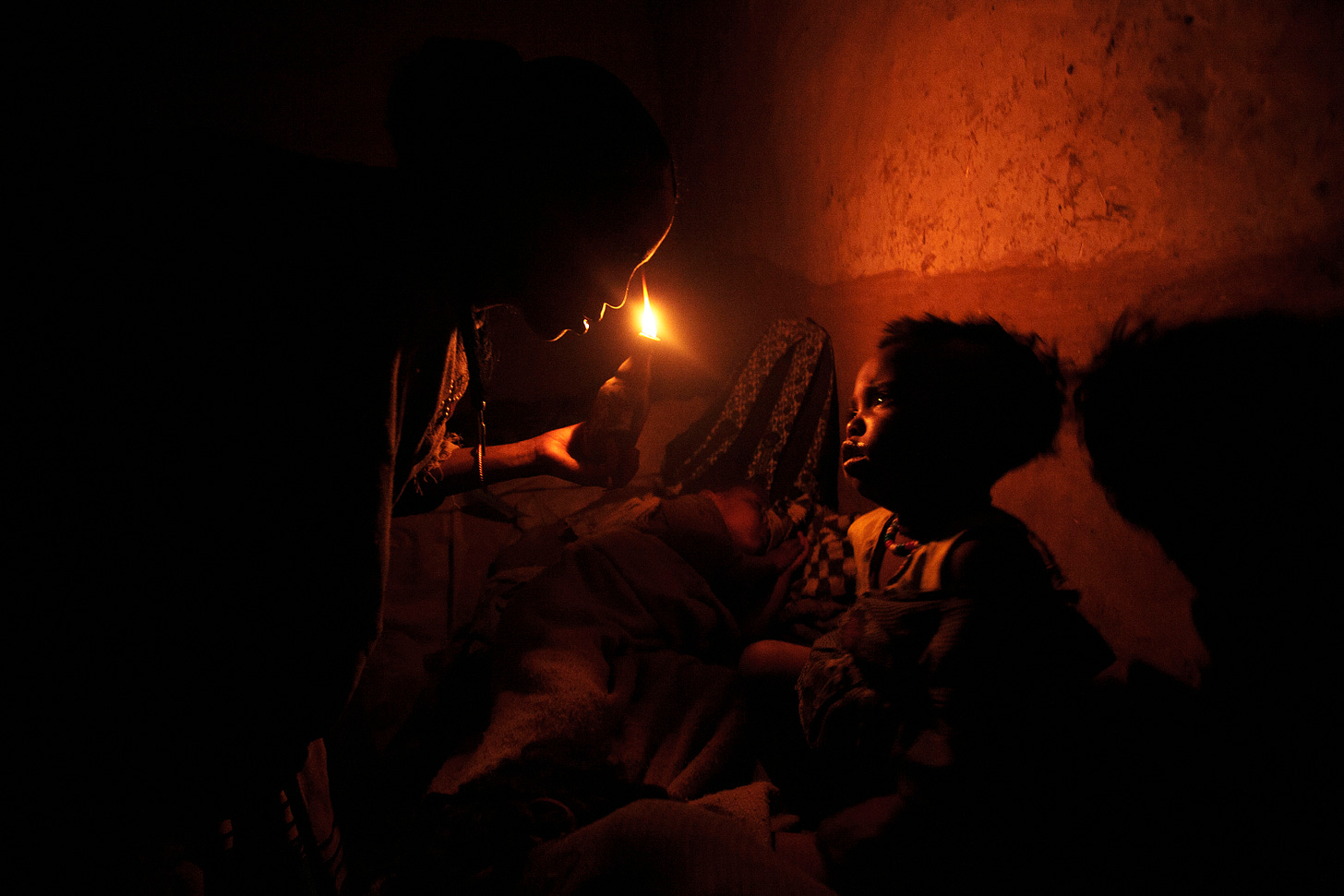
Often, I embrace shadows and the really dark tones.
And sometimes I push them so far that parts of the image simply fade into darkness.
Not because I don’t know how to expose properly,
but because I’m trying to achieve something specific.
My friend was surprised by this. Maybe more than he expected.
And I probably went on longer than he bargained for.
But I wanted to explain that I don’t approach exposure as a fixed technical target.
For me, exposure is a way to shape how an image communicates. It’s a deliberate choice, not a neutral one.
Every photograph begins with an intention, sometimes clear, sometimes instinctive, but always rooted in what I want the image to say and how I want it to feel.
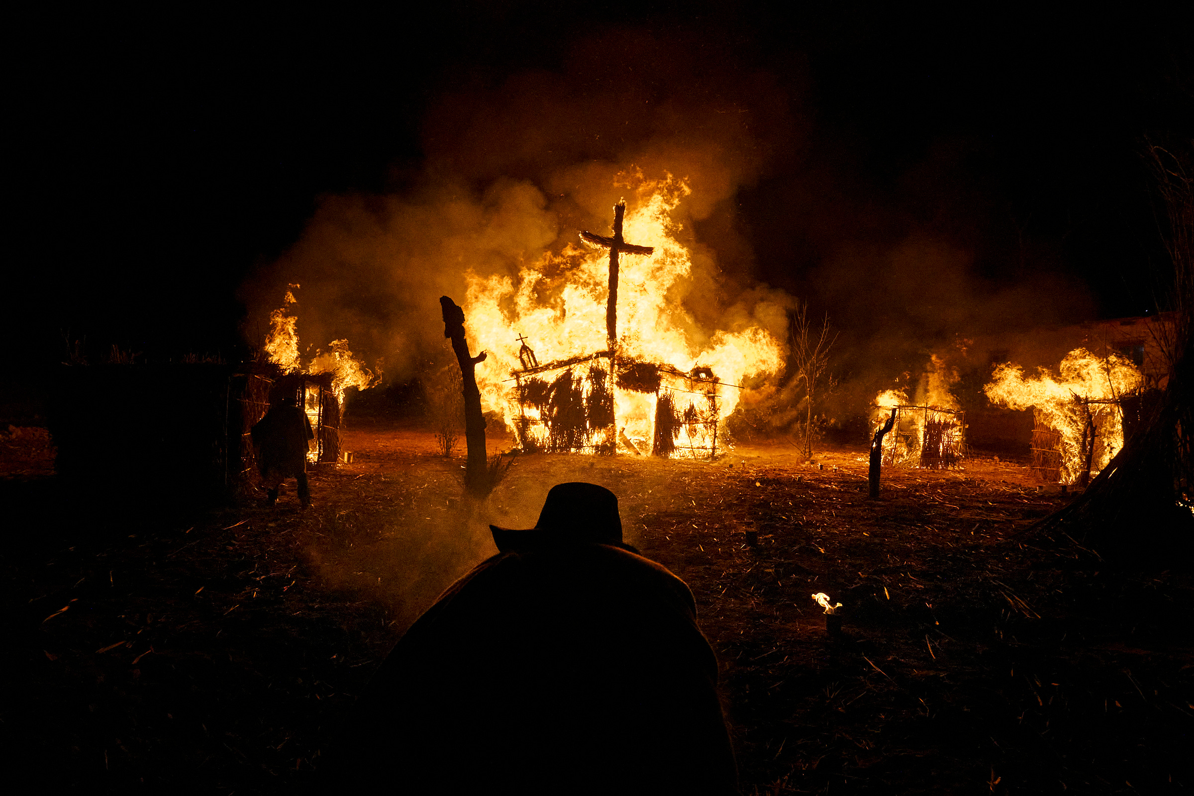
Atmosphere and mood can be just as powerful as a sense of story in a photograph.
This is where shadows come back into the conversation.
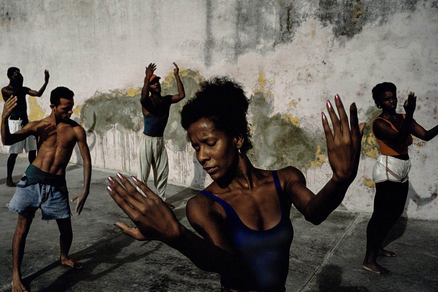
On a basic level, strong shadows and contrast can make an image feel dramatic, graphic, even iconic. The work of David Alan Harvey is a clear example. His images often allow shadows to swallow detail, deliberately simplifying form.
In the dancing scene, the shadows strip away facial detail and physical definition. Muscles and expressions fade, leaving movement and gesture as the dominant visual cues. The people stop reading as individuals and begin to read as shapes in motion. The scene becomes about energy rather than explanation.
This image describe less, yet carries more power—and becomes more iconic as a result.
Shadows can do more than create drama.
They can erase clutter, reduce complexity, and leave space for interpretation.
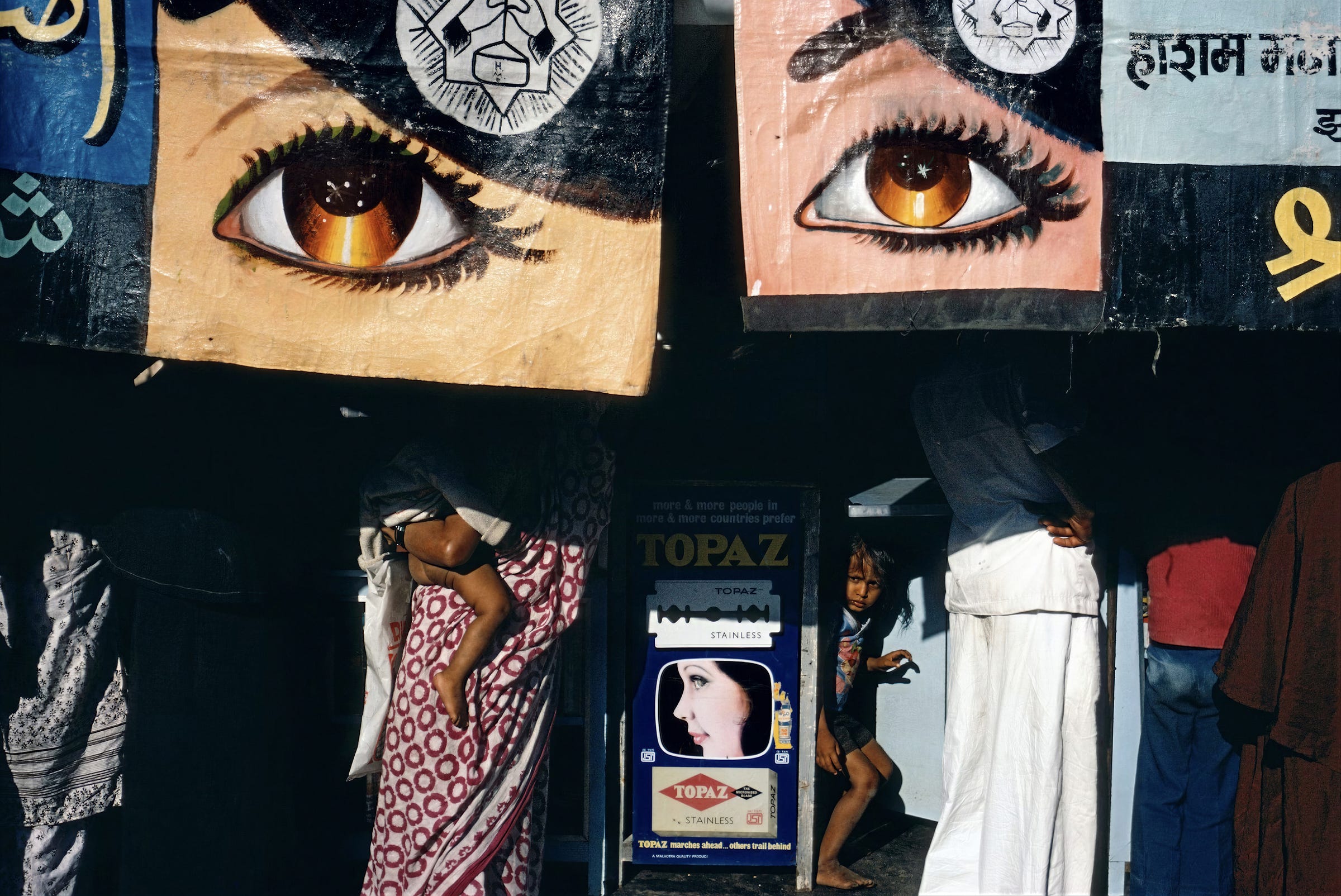
They work great in street photography, think Alex Webb’s images from The Suffering of Light, where large portions of the frame dissolve into darkness. Light cuts through the scene in fragments. Figures appear and vanish. Nothing is fully explained.
Those images don’t feel incomplete.
They feel deliberate.
Shadows, in this sense, don’t hide meaning.
They shape it.
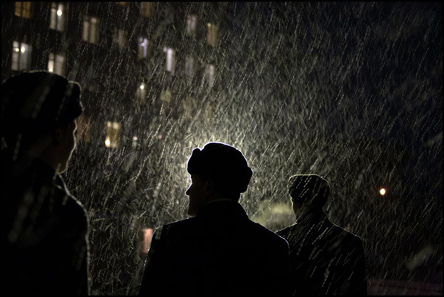
Gueorgui Pinkhassov takes this a step further. In his work, shadow doesn’t just fragment the scene. It begins to dominate it. Large areas fall into darkness, turning people into silhouettes or partial outlines. Identity fades. Faces disappear. Figures become shapes moving through light rather than subjects to be read.
What remains visible, rain catching a streetlight, reflections breaking across the frame, feels almost suspended against the dark. The photograph is no longer about describing a scene clearly, but about how light breaks through shadow. The image shifts away from description and becomes less literal, more atmospheric, reading more like visual poetry, where meaning emerges through contrast rather than clarity.
I’ve experimented with this in my own work too, letting parts of a scene drown in shadow, not as a mistake, but as a metaphor.
Darkness and light.
Presence and absence.
Form simplified, atmosphere intensified.
You could argue that, technically, these dark photographs are flawed. Today’s digital sensors allow far more shadow detail to be revealed than photographers typically chose, or were able, to show in the past.
So why not use the entire dynamic range and show all the detail in the shadows?
But, if you think about it, that’s not how we experience the world.
When we glance at a scene, we don’t register every shadow detail. We notice highlights. Movement. Contrast. Shapes. The rest falls away.
In that sense, deep shadows and hidden detail are often closer to how we see and feel a scene than perfectly balanced images. They leave something to the imagination.
And that’s where photographs begin to feel magical.
Eventually, my friend circled back. “But how do you do this technically?”
And here’s the part that usually surprises people.
Technically, it’s nothing special.
When I’m shooting, I generally aim for a fairly even exposure. I want as much usable information in the file as possible. I want flexibility later in post.
If highlights are at risk, I’ll underexpose just enough to protect them. If shadows start to lose detail, I still want them usable, without sacrificing the highlights.
The difference isn’t in how I expose.
It’s in what I decide later.
The real decisions happen in post.
I shoot RAW because I want all that data, not because I want neutrality.
In post-processing, I decide what deserves clarity and what fades into darkness.
Those decisions are never technical for me. They’re about communication.
They’re driven by what I want the image to evoke, how I want it to feel.
This is why I think of shadows as visual cues.
They guide emotion.
They establish mood.
They tell the viewer how to enter the frame and what to focus on.
A deep shadow isn’t just empty space.
It’s doing work.
If we judged photographs purely on exposure correctness, we might as well turn everything into HDR. That fad has long since passed. Every phone has the feature now, yet few of those images feel especially satisfying.
Contrast matters because more dynamic range doesn’t necessarily lead to more meaning, and because real power and drama often live in the shadows.
Beyond everything I’ve already mentioned, there is something profoundly beautiful about shadows precisely because they can communicate by not showing.
They can imply rather than explain.
They can suggest rather than describe.
And in photography, as in life, what’s implied often carries more weight than what’s fully revealed.
Once you start seeing shadows this way, good exposure stops being the goal.
Communication becomes the goal.
And this changes how you think about making photographs.
If these ideas around shadows, exposure, and visual cues resonate with you…
You’ll find a lot of value in my Visual Cues Program.
It’s a practical way to learn visual communication in photography. The goal is to help you create images with meaning and depth, not just ones that look good. The program explores these ideas in depth, supported by exercises and real-world examples. It also includes an AI-powered Visual Cues Coach that helps you see how effectively you’re already using visual cues and how to build on them. You can even upload photographs you admire and turn them into clear, practical case studies.
Visual Cues Program will help you think more clearly about what your images are actually communicating.


